Quick answer
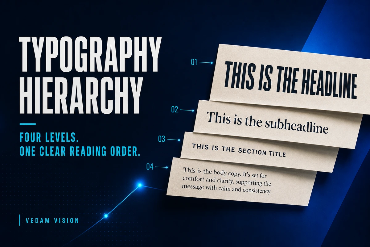
A useful typography hierarchy gives every line a clear job. A simple four-level system can use display text for the main promise, headings for sections, body text for explanation, and labels for supporting context. The levels should differ through size, weight, spacing, line height, and colour without making every line compete for attention. If everything is bold, the reader cannot tell what matters first.
Typography hierarchy is not decoration added after the message is written. It is the reading order of the message.
For a business, that reading order affects whether a prospect understands an offer, whether a customer finds the next action, and whether an employee can scan an internal document without losing the point. A beautiful typeface cannot rescue a page where every sentence asks to be the headline.
Why hierarchy matters to a business
Most people do not read a page from the first word to the last. They scan for a useful entry point. They look for the promise, the section that matches their question, the evidence, and the next action.
Good hierarchy supports that behaviour. It helps a reader answer four questions quickly:
- What is this about?
- What matters most?
- Where is the detail I need?
- What should I do next?
When those answers are unclear, a page feels demanding. The reader has to create the structure that the designer failed to provide.
Figma's official guide to typography systems explains that teams need consistent, legible patterns early in a design system. It also warns against creating so many options that designers no longer know which style to use. That balance is especially important for a small company. The system should be expressive enough for real work and simple enough to apply without a specialist watching every file.
The four-level typography hierarchy
Level one: display text
Display text carries the primary promise or idea. On a landing page, it may be the hero headline. In a proposal, it may be the central outcome. In a LinkedIn graphic, it is the phrase that must remain readable on a small screen.
Display text should be used sparingly. Its power comes from contrast with everything around it. A page with six display lines has no display line.
Choose a size and weight that can hold attention, then give it room. Tight line height often works for large headlines because the letters are already visually dominant. Avoid forcing a long paragraph into display styling. Edit the message until the headline can do one job well.
Level two: headings
Headings divide the message into useful sections. They are less dramatic than display text and more visible than body copy.
A heading should help a scanner predict what follows. “How pricing works” is stronger than “More information” because it names the reader's question. Clear words do more work than decorative weight.
Keep heading styles limited. Many business pages can work with one strong section heading and one smaller subsection style. More levels may be justified in a long report or knowledge base, but each level should have a real structural purpose.
Level three: body text
Body text carries the explanation. Its job is sustained readability, not visual performance.
Figma's guide suggests using more line height for body copy than for display text because dense text needs breathing room. It presents 1.5 times the font size as a starting point to test, not a universal rule. The correct value depends on typeface, line length, screen size, and contrast.
For website body copy, check the line length as carefully as the font size. Very wide paragraphs make it hard for the eye to find the next line. Very narrow paragraphs create constant interruptions. Mobile testing matters because a layout that feels calm on a wide monitor can become crowded on a phone.
Level four: labels and supporting text
Labels explain context without competing with the main message. Examples include a category, date, field name, caption, source, or small navigation cue.
Smaller does not mean unimportant or unreadable. A label should still meet practical accessibility and contrast needs. Use weight, case, tracking, or colour carefully. All caps can work for a short category label, but a full paragraph in all caps slows reading.
Supporting text should support. If a legal note, price condition, or essential instruction changes the decision, do not hide it in a tiny label style.
Use contrast with restraint
Typography hierarchy can be created through several controls:
- size
- weight
- line height
- letter spacing
- paragraph spacing
- colour
- position
- width
- typeface
You do not need to change all of them at once. Strong systems often use one type family and create hierarchy through size, weight, spacing, and placement.
When every control changes together, the page becomes noisy. A large, bold, coloured, uppercase line with wide tracking may be appropriate for one moment. Repeating that treatment across every section removes the contrast it was meant to create.
Use the fewest changes needed to make the order obvious.
A practical four-style starter system
An Indian SME or founder-led team can begin with four semantic names:
| Style | Job | Typical use |
| Display | Primary promise | Hero headline, campaign hook |
| Heading | Section structure | Service section, proposal chapter |
| Body | Explanation | Paragraphs, descriptions, guidance |
| Label | Context | Category, caption, field name, source |
Name styles by purpose, not by accidental appearance. “Heading” is easier to use than “Bold 32” because it explains the job. If the visual size changes later, the semantic name still makes sense.
Figma also notes that shared text styles reduce variability and allow updates to flow across files. For a business, that creates operational value. The team spends less time deciding how each heading should look and more time improving what it says.
The blur test
Open a design and blur your eyes slightly, zoom out, or view it as a small thumbnail.
Can you still identify the first point, the main sections, the body areas, and the supporting details?
This test removes the distraction of the actual words. It reveals the visual order. If three areas carry equal weight, decide which one should lead and reduce the others.
The blur test is useful for social graphics, landing pages, slides, proposals, menus, and dashboards. It is not a substitute for reading, accessibility checks, or user testing. It is a quick way to detect competition.
The content-first test
Before changing typography, improve the language.
Ask whether the headline contains one clear promise. Check whether each section heading describes the section. Remove repeated claims. Shorten labels. Break long paragraphs where the idea changes.
Typography cannot create a hierarchy when the content itself has no priorities.
This connects to a broader business principle in Vedam Vision's guide on why design is a business decision. A design choice should support comprehension, trust, action, or another defined outcome. “I like this font” is not enough to justify a system.
Common typography mistakes
Making every line bold
Bold works through contrast. When everything is bold, the body becomes tiring and the important line loses emphasis.
Using too many sizes
Small differences create accidental styles that are difficult to maintain. If 28, 30, and 32 pixels all perform the same job, choose one and make the system clearer.
Hiding essential information
Low contrast and tiny text may make a layout look clean while making it less useful. Important conditions should look important enough to be found.
Choosing novelty over readability
A distinctive display face can support brand character. Body copy usually needs calm, reliable reading. One typeface does not need to perform every role.
Ignoring real content
A system tested only with short placeholder text may fail when a real product name, Hindi phrase, price, legal line, or long customer question appears. Stress-test the system with actual content and devices.
A review checklist
Before approving a page or campaign, check:
- Is the first message obvious in three seconds?
- Does every heading describe what follows?
- Is body copy comfortable to read on mobile?
- Are labels visible without competing?
- Are there unnecessary one-off styles?
- Does spacing reinforce the same hierarchy as type?
- Can the system handle longer real content?
- Are contrast and accessibility requirements met?
- Can another team member apply the styles correctly?
The goal is not typographic perfection. It is dependable communication.
Build a reading order, not a font collection
A four-level typography hierarchy gives a small team a useful constraint. Display text earns attention. Headings organise. Body text explains. Labels provide context.
Once those jobs are clear, type choices become easier to evaluate. The question changes from “Which font looks better?” to “Which treatment helps the reader understand this level?”
That is a better design conversation and a better business decision.
Frequently asked questions
What is typography hierarchy?
Typography hierarchy is the visual ordering of text so readers can identify the main message, sections, explanation, and supporting details. It uses size, weight, spacing, position, and other controls to signal importance.
How many typography levels does a small business need?
Many small teams can begin with four levels: display, heading, body, and label. Add another level only when a real content structure requires it.
Should every heading be bold?
Not necessarily. A heading can gain emphasis through size, spacing, position, or colour. Weight is one control, not the whole hierarchy.
Can one font family create a complete hierarchy?
Yes. One flexible family can create clear levels through size, weight, line height, and spacing. A second family may add brand character, but it is not required.
How should typography hierarchy be tested?
Test it at thumbnail size, on mobile, with real content, and with accessibility checks. Ask whether readers can find the main point, scan sections, and read the details comfortably.