Quick Answer
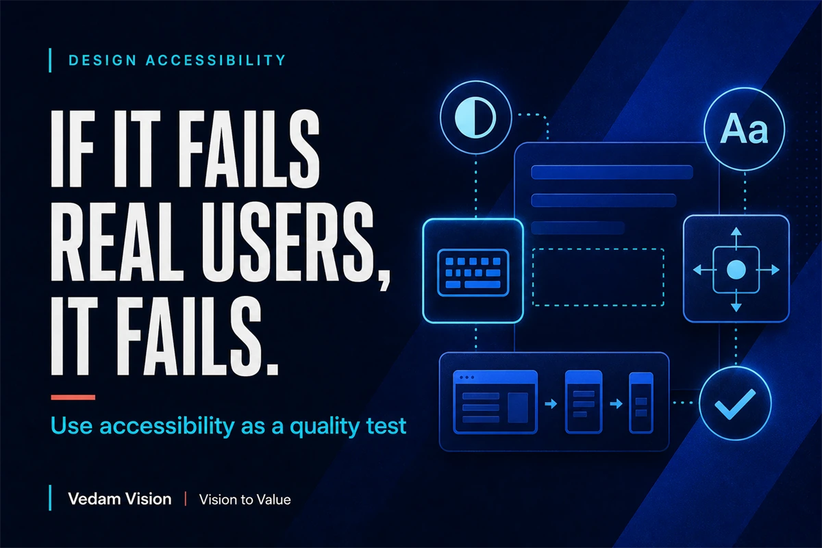
Accessibility is a practical design quality test, not a final compliance task. Check contrast, keyboard access, visible focus, text resizing, reflow, target size, labels, and error recovery while the interface is still being designed. These checks expose fragile hierarchy and interaction decisions early, improve usability for many people, and make remediation less disruptive.
If a design works only for a person with perfect vision, precise movement, a large screen, fast internet, and complete attention, the design is not finished.
Real users arrive with different bodies, devices, environments, languages, and levels of familiarity. They use a phone in sunlight, enlarge text, navigate with a keyboard, miss a subtle colour change, tap with one hand, or return to a form after an interruption.
Accessibility makes those conditions visible during design. It asks whether the experience remains understandable when the ideal conditions disappear.
That is why accessibility belongs in quality review from the first wireframe.
What WCAG 2.2 Gives a Design Team
The Web Content Accessibility Guidelines 2.2 are a W3C Recommendation. They organise testable success criteria around perceivable, operable, understandable, and robust content.
For designers, several criteria translate directly into everyday decisions. Text needs sufficient contrast. Content should remain usable when text is resized. Layouts should reflow without forcing unnecessary two-dimensional scrolling. Keyboard focus should be visible and not hidden. Controls need usable target sizes. Forms need clear labels and helpful error handling.
WCAG is more detailed than a single checklist, and conformance decisions should be made carefully. The practical advantage is that the standard replaces vague statements such as “make it accessible” with observable conditions that a team can design and test.
Accessibility is not the only measure of design quality. It is one of the strongest ways to reveal whether the visual and interaction system is resilient.
Start With Information Hierarchy
Accessibility begins before colour contrast. It begins with structure.
A clear page has a meaningful heading order, predictable reading sequence, grouped controls, understandable labels, and a visible primary action. When the hierarchy is weak, users must infer relationships from position, colour, or visual style alone.
Ask:
- Does the page have one clear purpose?
- Can headings describe the sections without surrounding decoration?
- Is the reading order logical when visual columns collapse?
- Do labels explain the action or only name an icon?
- Is the primary action different in meaning, not only colour?
This connects with the broader principle that teams should fix spacing and rhythm before changing colour. Spacing, grouping, and order communicate relationships. Colour can reinforce the structure, but it should not carry the entire meaning.
Build the content hierarchy in grayscale first. Then add colour and visual emphasis without weakening the underlying sequence.
Check Text and Interface Contrast
WCAG 2.2 includes minimum contrast ratios for text and images of text, with different requirements for normal and large text. It also includes non-text contrast requirements for interface components and graphical objects needed to understand content.
Design tools can calculate ratios, but the design decision still matters.
Check normal text, muted text, links, placeholder text, buttons, input boundaries, focus indicators, charts, icons, and states such as hover, selected, disabled, error, and success.
Do not test only the clean default screen. A component may pass in one state and fail in another. A button can have strong contrast until it becomes disabled. A form field can be clear until an error message appears in a light colour below it.
Also remember that contrast is not a substitute for hierarchy. Making every element dark and bold can produce a technically legible but visually exhausting interface. The design still needs a controlled scale of emphasis.
Design for Keyboard Use and Visible Focus
Some people navigate without a mouse. Others use a keyboard because it is faster, their trackpad is unavailable, or precise pointing is difficult.
Every interactive element should be reachable in a logical order. The current focus should be visible. Focus should not be hidden behind sticky headers, cookie banners, or modal layers.
During design review, move through the prototype using only the keyboard. Ask:
- Can every control be reached?
- Does the order follow the visual and content sequence?
- Is the focus indicator obvious on light and dark surfaces?
- Can a user escape menus and dialogs?
- Does opening a component move focus to a sensible place?
- Does closing it return focus appropriately?
Do not remove the browser's focus outline unless the replacement is at least as clear. A subtle brand-coloured glow may look elegant in a static mockup and disappear during real use.
Focus design is an excellent quality test because it forces the team to understand the interaction sequence, not just the resting appearance.
Test Text Resize and Reflow
WCAG includes criteria for resizing text and reflow. These checks expose layouts that depend on fixed heights, narrow labels, clipped buttons, or rigid columns.
Increase text size and narrow the viewport. Watch what happens to navigation, cards, tables, forms, dialogs, and call-to-action areas.
Common failures include:
- Text clipped inside a fixed-height card
- Buttons that truncate the action label
- Labels overlapping inputs
- Horizontal scrolling across the entire page
- Sticky elements hiding content
- Multi-column layouts collapsing in the wrong reading order
- Icons remaining visible while their text disappears
Responsive design is not only about fitting the original layout onto smaller screens. It is about preserving meaning and function as space changes.
For small Indian businesses, this matters commercially. Customers may arrive on affordable Android devices, variable connections, or browsers with personalised text settings. A robust layout protects the offer from conditions the design team cannot control.
Make Targets Large Enough for Real Use
WCAG 2.2 added a minimum target-size criterion at Level AA, with defined exceptions. The underlying lesson is direct: do not make important controls require unnecessary precision.
Review close buttons, menu triggers, pagination, carousel controls, checkboxes, radio buttons, icon-only actions, map pins, and links placed close together.
The visible icon and the clickable area do not have to be the same size. A small icon can sit inside a comfortably sized target when spacing and layout are designed well.
Target size is not only a mobile concern. It affects users with tremor, limited dexterity, temporary injury, low-quality pointing devices, or a moving environment.
When a team resists larger targets because the design feels less “clean,” the real issue may be density. Remove lower-priority actions or group them more intelligently instead of shrinking every control.
Use Labels That Survive Without Visual Guessing
An icon may be obvious to the design team and unclear to a new user. Placeholder text may seem efficient and disappear as soon as someone starts typing. A red border may show that something is wrong without explaining what to fix.
Use persistent labels. Write action-oriented button text. Pair colour with text, shape, or another signal. Keep the accessible name aligned with the visible label where possible.
For forms, explain errors near the relevant field and provide a useful summary when several issues exist. A message such as “Invalid input” reports failure without helping recovery. A better message explains the expected format or missing information.
This is also good conversion design. Clear labels reduce hesitation, support trust, and make the next step easier to understand.
The same principle appears in direct answers beating vague thought leadership. Clarity earns attention because the reader or user does not have to decode the intention.
Put Accessibility Into the Design System
If every project remembers accessibility from scratch, results will be inconsistent.
Store accessible defaults inside components and tokens:
- Approved colour combinations
- Type sizes and line heights
- Focus styles
- Minimum interactive target areas
- Form labels, instructions, and error patterns
- Keyboard behaviour for menus, dialogs, and tabs
- Motion preferences and alternatives
- Content rules for links, buttons, and headings
Document the states, not only the default component. Include loading, empty, error, success, selected, disabled, expanded, and collapsed behaviour.
A design system does not guarantee accessibility. It reduces the number of decisions that can drift and gives reviewers a consistent baseline.
This is another reason a brand system must extend beyond a logo. A trustworthy digital brand includes behaviour: how clearly it communicates, how predictably it responds, and whether people can use it under different conditions.
Add Accessibility to Every Review Stage
At concept stage, check content order, interaction model, and potential barriers.
At design stage, check contrast, focus, target size, labels, states, resize, and reflow.
At build stage, test semantics, keyboard behaviour, screen-reader output, zoom, device behaviour, and real content.
Before release, test critical journeys such as sign-up, purchase, contact, login, error recovery, and account changes.
After release, include accessibility issues in the same backlog as other quality defects. Track ownership and severity. Test again when a component, framework, content pattern, or third-party tool changes.
Automated tools are useful for repeatable checks, but they cannot judge every issue. Combine automated checks with keyboard testing, assistive-technology testing, and feedback from people with disabilities where possible.
A Practical 30-Minute Design Review
Choose one important screen and run this review:
- Read the headings without the body. Does the structure make sense?
- View the screen in grayscale. Is hierarchy still clear?
- Check text, controls, icons, and states for contrast.
- Navigate using only the keyboard. Can you see and predict focus?
- Increase text size and narrow the screen. Does content reflow?
- Inspect targets and crowded controls.
- Review labels and error recovery.
- Record defects with an owner and component reference.
The review will not prove complete conformance, but it will reveal whether accessibility is part of the design's quality or merely postponed.
Final Takeaway
Accessibility is not a special layer added after the “real design” is complete. It is evidence that the design can survive real use.
Use WCAG 2.2 as a source of concrete criteria. Build accessible defaults into the system. Test hierarchy, contrast, keyboard access, focus, resizing, reflow, targets, labels, and recovery before launch.
When accessibility improves, the experience often becomes clearer for everyone.
Frequently Asked Questions
Is WCAG 2.2 only for developers?
No. Many criteria affect information hierarchy, colour, focus treatment, target size, labels, motion, error design, and responsive behaviour, so designers and content teams have direct responsibilities.
Does passing an automated accessibility scan mean a website is accessible?
No. Automated tools can detect some issues, but manual keyboard testing, assistive-technology testing, content review, and human judgment are still required.
When should accessibility testing begin?
Begin during content structure and wireframing, continue through visual design and development, and repeat before and after release when the product changes.
Can accessible design still look premium?
Yes. Strong hierarchy, readable typography, clear interaction states, sufficient contrast, and comfortable targets can support a distinctive and premium visual system.
Which accessibility checks should a small team start with?
Start with heading order, contrast, keyboard navigation, visible focus, text resizing, reflow, target size, persistent labels, and clear error recovery on the most important user journeys.