Quick answer
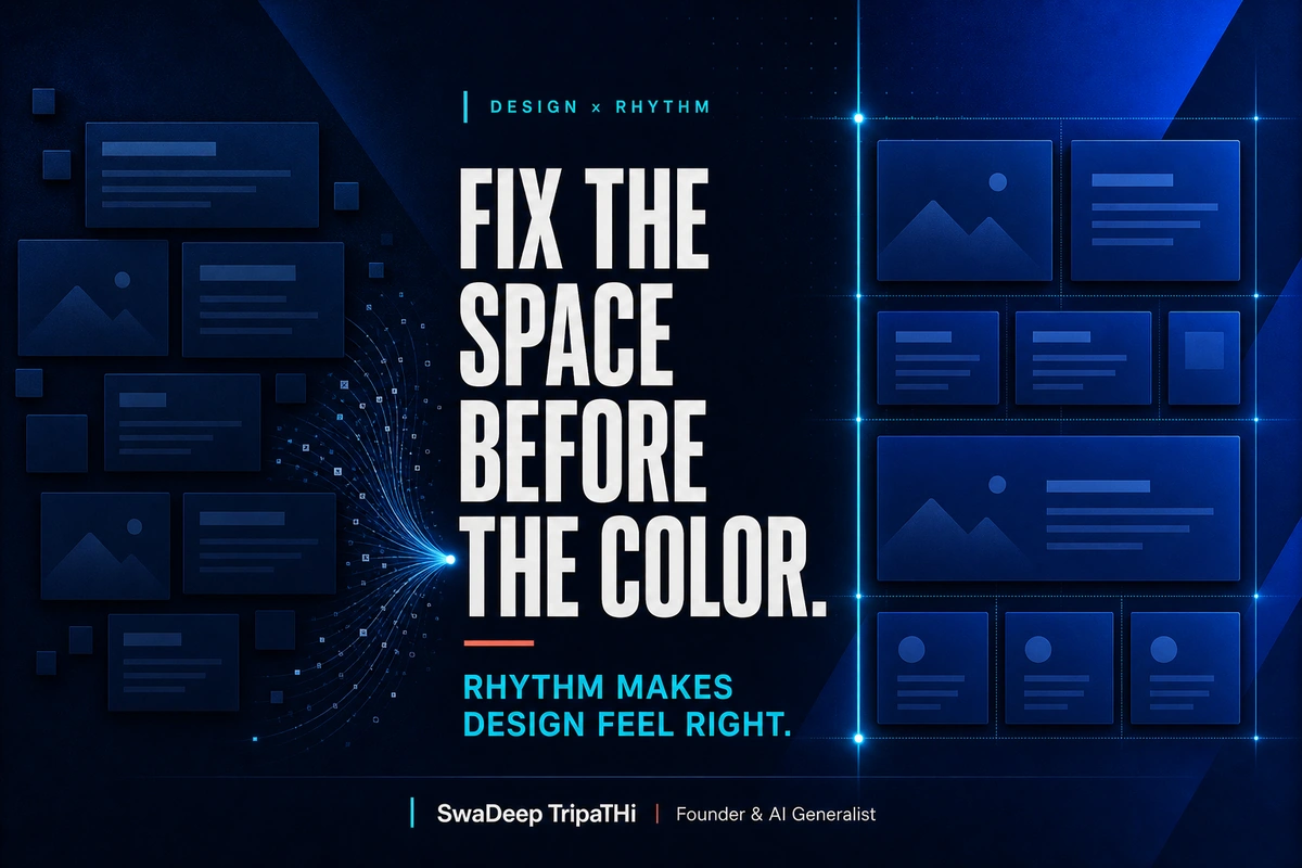
When a page feels weak, inconsistent, or crowded, audit design spacing rhythm before changing the colour palette. Space controls grouping, hierarchy, pace, and readability. A consistent spacing scale and vertical rhythm often make the current colours feel more deliberate because the layout finally explains what belongs together, what deserves attention, and where one section ends. Change colour only after structure, type, and spacing are doing their jobs.
Colour gets blamed for structural problems.
A founder opens a new landing page and says it feels dull. The team tries a brighter button, a darker background, and another accent. The page becomes more colourful, but it still feels unsettled.
The actual problem may be twelve unrelated gaps, headings that float between sections, cards with inconsistent padding, and body copy packed too tightly under titles.
Colour can create emphasis. It cannot repair a broken relationship between elements.
Spacing is quieter, which is why it is easier to overlook. Yet it shapes the page before a visitor reads the message. It tells the eye what is grouped, what is separate, and what matters. Rhythm turns those individual gaps into a repeated pattern that makes the experience easier to scan.
What design spacing rhythm means
Spacing is the distance inside and between elements. Rhythm is the pattern created when those distances repeat with purpose across a page.
Think about a service section. The icon, heading, and description should feel like one group. That group needs less internal space than the distance separating it from the next service. If every gap is the same, the reader has to work out the structure alone.
Rhythm also comes from typography. Font size and line height determine the height of text blocks. Paragraph spacing determines how ideas breathe. Section spacing determines the pace of the page.
The GOV.UK Design System's official type scale guidance explains that its font sizes and line heights use a consistent vertical rhythm. Its spacing guidance provides responsive and static scales so layouts can remain coherent across screen sizes.
The lesson is not to copy those exact numbers. It is to stop inventing every gap independently.
Why colour changes feel productive
Changing colour gives an immediate before-and-after comparison. It is visible in a review call and easy to debate.
Spacing work is less dramatic. Moving a heading eight pixels may look minor in isolation. Correcting the same relationship across twenty components can change the entire product.
Colour also carries subjective language. One person says premium means black and gold. Another says blue feels trustworthy. These conversations can continue without resolving whether the visitor understands the offer.
Spacing gives the team a more practical question: is this element related to the one above it or the one below it?
That question can be answered in the layout.
Start with relationships, not measurements
Before choosing a spacing scale, map the relationships on the page.
Use three levels:
- Inside a component: icon to label, label to value, input to help text.
- Between related components: cards in a group, fields in a form, items in a list.
- Between sections: hero to proof, proof to services, services to the final action.
The closer the relationship, the smaller the gap usually needs to be. Strong section breaks need more space than paragraph breaks. This creates hierarchy without adding lines, boxes, or extra colours.
IBM's official Carbon Design System spacing guidance makes this relationship explicit. It describes how proximity signals connection, while more space weakens the perceived relationship and can create hierarchy or focus.
That is the business value of white space. It is not empty decoration. It reduces the explanation the interface has to provide.
Build a small spacing scale
A useful spacing scale gives the team enough options without inviting random values.
One practical starting set is:
| Token | Example value | Typical role |
|---|---|---|
| XS | 4 px | Icon adjustment or compact detail |
| S | 8 px | Label to input or icon to text |
| M | 16 px | Standard component padding |
| L | 24 px | Related groups or card padding |
| XL | 32 px | Subsection separation |
| 2XL | 48 px | Major section spacing on small screens |
| 3XL | 64 px | Major section spacing on larger screens |
These are examples, not universal rules. Your type scale, brand density, product, and screen sizes should shape the final tokens.
The important practice is using named roles. A designer should be able to say, "This is section spacing" rather than, "This looked better at 43 pixels."
When a special case appears, first ask whether the component is using the wrong token. Add a new value only when the need repeats and cannot be solved by the existing scale.
Fix the vertical rhythm
Vertical rhythm is the repeated pace from the top of the page to the bottom.
Audit these relationships:
- Category label to headline
- Headline to supporting copy
- Supporting copy to primary action
- Heading to first paragraph
- Paragraph to paragraph
- List introduction to list
- Card title to card body
- Last element in a section to the next section
Look for drift. A heading may have 12 pixels below it in one section, 24 in another, and 40 in a third. Each instance may look acceptable, but the page loses cadence.
Create rules that match content roles. A section heading can have more space above than below because it begins a new group and belongs to the content that follows. A card heading needs a smaller gap because the card is compact.
Vedam Vision's article on the psychology of visual design in marketing explains how hierarchy helps guide attention. Spacing is one of the most dependable ways to create that hierarchy without adding noise.
Fix internal padding before outer margins
Cards, buttons, inputs, alerts, and navigation items create the texture of a page.
When their internal padding is inconsistent, the page feels improvised even if the overall grid is aligned. Start with the component interior:
- Does the text have enough breathing room?
- Are icons centred optically, not only mathematically?
- Do buttons with different labels keep the same height?
- Are cards in the same family using the same padding rule?
- Does the input label feel connected to its field?
Then set the space between components. This order prevents the outer layout from compensating for unstable internals.
Do not confuse more space with better design
White space is useful when it communicates. Excessive space can weaken a task.
A mobile user should not scroll through a full screen of emptiness to reach a form. Related facts should not be separated so widely that they look unrelated. A dense operations dashboard may need compact patterns because comparison matters.
Density should follow the work.
For a hospital appointment page, clarity and calm may justify generous spacing. For a stock management table, efficient scanning may require a tighter rhythm. The same brand can support both through different component modes built on one scale.
Make rhythm responsive
Desktop spacing should not simply shrink by the same percentage on mobile.
Some gaps can stay stable because touch targets and readability need protection. Large section spaces may reduce on smaller screens to keep the task moving. Long headlines may wrap into more lines and create extra height by themselves.
The GOV.UK spacing scale provides different values for certain units on smaller and larger screens. That is a useful model: define responsive decisions in the system instead of fixing them page by page.
Test the page at actual widths with real content. A design can look balanced with a short English headline and break when the copy becomes longer, bilingual, or more specific to the offer.
Vedam Vision's guide to web accessibility standards for Indian businesses is a useful reminder that responsive design must also tolerate zoom, reflow, and user settings.
Text spacing is also an accessibility requirement
Visual rhythm cannot be locked so tightly that users lose content when they change text settings.
WCAG 2.2 includes a text spacing success criterion. The W3C explanation of text spacing says content should not lose information or functionality when users apply specified increases to line height, paragraph spacing, letter spacing, and word spacing.
This does not mean every site must use those exact values by default. It means the interface should adapt when a user needs different spacing.
Avoid fixed-height text containers that clip longer lines. Check buttons, cards, menus, and alerts when text wraps. Use relative units where appropriate. Make sure a decorative layout does not depend on one exact line break.
A spacing-first redesign audit
Before changing the palette, take screenshots of five representative pages at mobile and desktop widths.
Pass 1: remove accidental values
List margins, padding, gaps, line heights, and component heights. Find values that sit outside the system without a clear reason.
Pass 2: repair grouping
Circle elements that belong together. Reduce the space inside each group. Increase separation between unrelated groups where necessary.
Pass 3: restore hierarchy
Compare the space around H1, H2, H3, body copy, proof, and actions. The rhythm should reflect importance and reading order.
Pass 4: test real content
Replace placeholder copy with final headings, prices, product names, FAQs, and form errors. Test the longest realistic examples.
Pass 5: inspect mobile and accessibility states
Check zoom, text spacing changes, keyboard focus, translated content, and narrow screens.
Only after this pass should the team review colour. The palette discussion will be more useful because the layout is no longer asking colour to create every relationship.
Vedam Vision's website redesign checklist can help widen the audit to performance, content, conversion, and technical quality.
When colour really is the problem
Colour still matters.
Change it when contrast is insufficient, interactive states are unclear, the palette conflicts with the brand position, or the visual system cannot scale across required media. Test contrast against the applicable accessibility standard. Do not rely on colour alone to communicate status.
The order matters. First establish structure. Then use colour to reinforce it.
Frequently asked questions
What is design spacing rhythm?
Design spacing rhythm is the repeated pattern of distances inside components, between related elements, and across sections. It helps a page communicate grouping, hierarchy, pace, and readability.
Should every website use an eight-pixel spacing grid?
No. An eight-pixel base is common, but the right scale depends on typography, density, platform, brand, and content. Consistent named roles matter more than copying one universal grid.
Can white space improve conversion?
Clear spacing can make an offer and action easier to understand, but it does not guarantee conversion. The offer, trust, copy, performance, traffic quality, and follow-up also influence results.
How do I know if a page has too much spacing?
Spacing is excessive when related content feels disconnected, important tasks require needless scrolling, comparison becomes harder, or the layout wastes space without improving clarity.
Should spacing change on mobile?
Yes, some larger layout gaps may reduce on smaller screens, while touch targets, readability, and content grouping must remain protected. Define responsive tokens and test real content rather than shrinking every value uniformly.
Structure first, colour second
When a page feels wrong, resist the quickest visible fix.
Repair the relationships. Stabilise the component padding. Give headings a dependable rhythm. Let sections breathe according to their importance. Test the same rules on mobile and with accessible text settings.
Then review colour.
Often, the palette will need less work because the page finally has a structure worth emphasising.
If your website feels inconsistent but the cause is hard to isolate, Vedam Vision's website design and development service can audit the layout system, content hierarchy, components, and implementation before a redesign creates more surface-level change.