Quick Answer
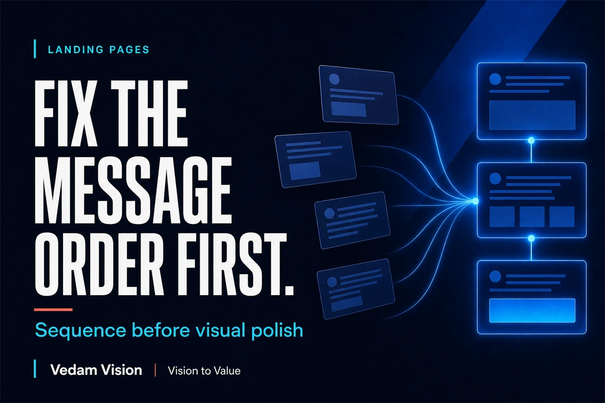
Fix a landing page's message order before polishing the interface. The page should quickly explain what the offer is, who it serves, which problem it solves, why the visitor should believe it, and what action comes next. Write one sentence for each job, arrange the sequence in plain text, remove repeated claims, and only then use type, spacing, colour, imagery, and motion to make the argument easier to scan.
Most landing pages have a sequence problem before they have a design problem.
The page may use modern typography, smooth motion, premium imagery, and careful spacing. Yet the visitor still has to assemble the argument alone.
One section describes the product. Another lists broad benefits. A testimonial appears before the reader knows what it proves. The call to action arrives before the offer feels credible.
Visual polish cannot repair an unresolved message order. It can only make the confusion more expensive.
What Message Hierarchy Really Means
Message hierarchy is the order in which a page answers the visitor's questions.
It is not only the size of the headline or the placement of a button. It begins with content decisions:
- What is this?
- Who is it for?
- What problem does it solve?
- What is the practical outcome?
- Why should I believe this business?
- What should I do next?
Different offers may require a different sequence. A simple local service may move quickly from problem to proof to contact. A high-value B2B service may need more explanation, process detail, evidence, and risk reduction.
The principle stays the same. Every section should prepare the next decision.
Start With a Plain-Text Page
Before opening the design file, write the page as a sequence of short statements.
For example:
- Audience: Indian SMEs with repeated manual customer follow-up.
- Problem: enquiries are lost because ownership and timing are unclear.
- Offer: a managed automation workflow that captures, assigns, and follows up.
- Outcome: fewer missed opportunities and a visible process.
- Evidence: current workflow audit, implementation plan, and defined review points.
- Action: book a workflow review.
This is not finished copy. It is the logic of the page.
Read it without colour, icons, or screenshots. If the argument is weak in plain text, visual treatment will not strengthen the underlying promise.
The article on design as a business decision makes the same distinction. Design choices should serve a communication and business job, not only personal preference.
Give the Hero One Job
The hero should help the right visitor recognise the offer and decide whether to continue.
It normally needs:
- A clear category or offer
- A specific audience or problem
- A believable outcome
- One primary next step
- Supporting evidence when the claim needs it
Avoid stacking several equal promises in the headline and subheadline. “Grow faster, work smarter, transform your business, and unlock the future” gives the visitor no useful picture.
Specific language creates a stronger filter. “Automate enquiry assignment and follow-up for Indian service teams” is narrower, but it gives the relevant buyer a reason to continue.
The hero does not need to explain everything. It needs to earn the next scroll.
Move From Promise to Mechanism
After the opening promise, explain how the outcome becomes possible.
A mechanism is the connection between the offer and the result.
If a service promises faster delivery, the mechanism may be a standardised intake, reusable components, defined approval windows, and parallel production. If an AI workflow promises fewer missed enquiries, the mechanism may be structured capture, ownership rules, timed reminders, and exception handling.
Without a mechanism, outcomes sound like advertising language. With a mechanism, the visitor can judge whether the offer is credible.
Use three to five steps when the process genuinely has that structure. Do not force every offer into a five-card row. The page should reflect how the service actually works.
Place Proof Beside the Claim It Supports
Proof is more useful when the visitor does not need to remember what it refers to.
Put a relevant testimonial beside the outcome it supports. Place security information near a data-sensitive workflow. Show the product interface near the task it helps complete. Link a factual claim to its source.
Proof can include:
- Product demonstration
- Process detail
- Named qualifications
- Verified customer evidence
- Case material approved for publication
- Primary-source data
- Clear deliverables and boundaries
- Transparent pricing or engagement conditions
Do not invent numbers, testimonials, client names, or outcomes. A modest verified proof is stronger than a dramatic claim the business cannot defend.
This is especially important for new brands. The guide on building trust beyond a logo explains how trust comes from aligned behaviour, message, experience, and visual identity.
Remove Repeated Sections
Landing pages often repeat the same promise under different headings:
- Why choose us
- Our benefits
- What makes us different
- Why we are trusted
If all four sections say “quality, innovation, and customer focus,” the page is not building an argument. It is increasing length.
Assign one job to each section. Use a working label during editing:
- Recognition
- Problem
- Mechanism
- Outcome
- Evidence
- Objection
- Action
If two sections have the same job, combine them or remove one.
Length is not the enemy. Repetition without added decision value is.
Design the Visual Hierarchy Around the Message
Once the sequence works, use visual design to make it easier to understand.
Typography
Create a clear difference between the primary promise, section headings, body copy, labels, and supporting detail. Use fewer styles with stronger roles.
Spacing
Group related elements and separate different ideas. The article on fixing spacing and rhythm before colour explains why spacing often solves hierarchy problems more directly than a new palette.
Colour
Use colour to reinforce priority, state, and brand recognition. Do not rely on colour alone to communicate meaning.
Imagery
Choose images that explain the offer, demonstrate the product, reveal the process, or build an appropriate emotional frame. Decorative stock photography should not occupy the strongest area without adding meaning.
Motion
Use motion to show relationship, progress, or change. Avoid animation that delays reading, hides controls, or competes with the call to action.
Run the Three-Second and Thirty-Second Tests
The three-second test asks whether a new visitor can identify the category, audience, and primary value quickly.
Do not treat three seconds as a universal research law. Use it as a practical internal review.
The thirty-second test asks whether the visitor can explain:
- What the business offers
- Who should care
- What makes the approach credible
- What action to take
Test with people who did not write the page. Ask them to explain it in their own words. Do not help.
If they repeat the headline but cannot explain the offer, the message may be memorable but incomplete.
Design for Scanning Without Writing Only Fragments
Visitors scan. They also read when the decision matters.
Use clear headings, short opening sentences, useful lists, and visible proof. But do not turn every idea into a slogan. Important offers need complete explanation.
Place the central point at the start of each section. Let supporting detail follow. Use bold text sparingly for genuine anchors.
On mobile, check whether the sequence survives. A desktop two-column layout may reverse the intended reading order when stacked. Decorative elements may appear before the explanation they support.
Message hierarchy must work in the actual responsive layout, not only the design presentation.
Give the Call to Action a Clear Next Step
“Get started” can be appropriate, but it often hides the real commitment.
Use a call to action that explains the next step:
- Book a workflow review
- Request a project estimate
- See the product demo
- Download the checklist
- Start the assessment
Support it with expectation-setting copy. Explain what happens after the click, how long it takes, what information is needed, or whether the conversation is exploratory.
Reduce competing actions. A page can have repeated access to the same primary action, but several different primary decisions create hesitation.
A Practical Rewrite Process
Use this sequence:
- Interview the offer owner and one customer-facing person.
- Write the audience problem in one sentence.
- Write the offer and mechanism in one sentence each.
- List verified evidence.
- Choose the primary action.
- Arrange the page in plain text.
- Remove repeated claims.
- Design the hierarchy.
- Test comprehension on desktop and mobile.
- Measure the intended action and revise.
Do not begin by replacing the colour palette. Begin by deciding what the page must help a visitor understand.
Measure the Message, Not Only the Button
Conversion matters, but it is not the only diagnostic signal.
Review:
- Scroll progression
- Interaction with proof or process sections
- Form starts and completions
- Qualified versus unqualified enquiries
- Questions asked in sales conversations
- Where prospects misunderstand scope or value
- Mobile drop-off and error patterns
If enquiries rise but fit declines, the promise may be broad. If visitors reach the form but abandon it, expectation or friction may be wrong. If sales calls repeat the same basic question, the page may be missing a necessary explanation.
Use the evidence to revise the sequence, not only the button colour.
Final Takeaway
A landing page is an argument made visible.
Write the message hierarchy first. Explain the offer, audience, problem, mechanism, proof, and next action in a sequence the visitor can follow. Remove repeated sections. Then use visual design to make the argument easier to scan and remember.
Polish should amplify clarity. It should not disguise the absence of it.
Frequently Asked Questions
What is landing-page message hierarchy?
It is the order in which the page explains the offer, audience, problem, outcome, mechanism, evidence, objections, and next action.
Should every landing page use the same section order?
No. The sequence should reflect the visitor's awareness, offer complexity, risk, evidence, and decision. The key is that every section has a clear job.
How much copy should a landing page have?
Use enough copy to support the decision without repetition. A simple low-risk offer may need little explanation, while a complex B2B service may require deeper mechanism, proof, and objection handling.
When should visual design begin?
Visual exploration can begin early, but final hierarchy should follow a stable content sequence. The strongest design decisions need a clear message job.
How can a team test whether the message is clear?
Ask someone outside the project to explain the offer, audience, value, credibility, and next action after a short review on both desktop and mobile.